
New ID cards were introduced at the beginning of the semester and there are several noticeable differences from the old ones. Each change has been well thought out, and however small or unnoticeable, they all serve a purpose in making ASL a safer place.
However, there have been several complaints that the new size distorts the photo and changes the appearance of the user. Seventh grader Magnus Dorre said, “I dislike that it makes my face look big and the definition of the face is bad.”
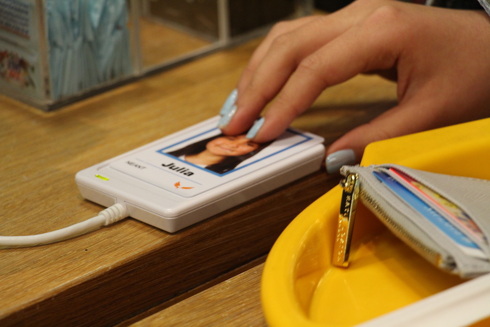
According to security guard Mr. Bhupendra Patel, this change was important, however, as it is easier to see if an ID card matches a person. Before, the picture was too small to clearly match up to whoever was holding the card.
Another difference is that these new cards feature the name of the owner in a large font so it is easy to read. Sixth grade math teacher Laura Brown said, “I like that it has my name on it. Now the security guards say ‘Good morning, Laura.’ It makes me feel more like a person.”
Seventh grade social studies teacher Latham Cameron shared similar views, and said, “I like this one better because it has the names larger so I can get to know people.”
Furthermore, a subtle but important change has been made to the frame of the picture. Mr. Patel said, “The other ones were all the same. Now the colors show who the person is.” Students have a blue frame, faculty and staff have bright orange, and parents have a green frame.
This new feature makes it easier to identify adults in the building. For example, if a student were looking for a teacher to help them find their way to class, they would know who to ask for help.
The new card also has an eagle in the corner that has not gone unnoticed by Mr. Cameron. He said, “The new eagle is cool, I didn’t like the old one.” As well as adding an artistic touch to the card, the logo also replaces the school’s name.
According to Mr. Patel, this is to prevent strangers from picking up a lost card on the street and easily being able to track down the owner. The old cards had the school’s name on them, so students, faculty and parents could all be found very easily. Although the change of cards may seem unnecessary, it is an important step to protect the school and clearly express one’s identity, while ensuring individual privacy.